Brand Design
In 2021 led the creative team in the re-branding of GreaterGood. We called the project A New GreaterGood. Before digging into any site redesign, we developed a loose style guide that was the first look into what GreaterGood should visually represent across all mediums — digital, social and print.
As the project sponsor I was the decision-maker on GreaterGood branding, “look & feel”, and all of the messaging. I defined the creative requirements, led creative brainstorming, led the design team to create the style guide and worked directly with stakeholders on project requirements.
-

Logo
The logo explains the overall mission of GreaterGood to create inspiring experiences that connect people, making it easy to do good.
-

Persona
Grace is well traveled and wants a way to show her support and give back to communities she’s explored. She likes to have special items that make “everyday ordinary” feel unique and meaningful.
Image Aesthetic
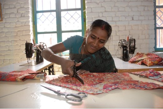
The stock library visually portrays what GreaterGood represents as a brand. The images present an end to end timeline from creator to cause to support, in which the GreaterGood consumer and community engages themselves to make a difference. Together we source and support the colors of the world.


Texture
Content Banner
An example of a donation collection banner using the brand style guide.

By creating a style guide and agreeing on a “look & feel” made it easier to make decisions in the site re-design process. The guide provided consistency across all the various teams at GreaterGood.
Results
Focused persona segmentations
Increased clickthrough rates in email campaigns ( 3%)
Fortified an increased brand presence among all user platforms by cutting design timelines over 25% per week.
Improved the brand messaging score (went from an F to a B)


